← All work
DashboardResponsive web appFreelance

Proradius

A dashboard for internet service providers that keeps subscribers, services, network and billing in one place: smooth internet management and happy users.

Role
UX and UI design (freelance)
Type
Responsive web dashboard
Year
2024
Tools
Figma
The challenge

ISP teams were juggling subscribers, plans, routers and payments across separate tools, with no single view of what needed attention.

What I did

Designed the responsive dashboard as a freelancer: the information structure, table and form patterns, the visual style and a full dark mode.

The result

One place to run the business: live counts up front, the same patterns on every screen, and a dark theme for people who work in it all day.

Fig 1Proradius
Proradius, presentation shot

a whole network at a glance

light and dark

Overview

ISP teams juggle subscribers, service plans, routers and payments across separate tools. Proradius brings them into one dashboard: live counts, the services people use most, and what needs attention today.

proradius · overview
Overview of the dashboard
MassaThe cards on the home screen answer the first questions an operator asks every morning.

Visual style

A confident blue for actions and data, neutral surfaces, and one type family across dense tables and charts.

proradius · visual style
Colour palette and typography

Featured screens

Subscriber lists, service editing, plans and reports follow the same table and form patterns, so every new screen feels familiar.

proradius · featured screens
Featured dashboard screens

Dark mode

A full dark theme for operators who live in the dashboard all day, with charts and status colours tuned for contrast.

proradius · dark mode
The dashboard in dark mode

Key decisions

A dashboard is used for hours at a time, so consistency mattered more than novelty.

  1. Answer the morning questions firstThe home screen's cards show what an operator checks first: active subscribers, popular services and what needs action today.
  2. One pattern for every tableSubscribers, services, plans and reports share the same tables, filters and forms, so a new screen never needs learning.
  3. Colour that carries meaningOne blue for actions and data, status colours kept for status, all tuned to stay readable in dark mode.

The outcome

A full dashboard design covering subscribers, services, network, billing and reports, in light and dark, built on shared components that keep every new screen quick to design and build.

In a tool people live in all day, familiar beats clever.
Massa, on Proradius

More work

  1. Elevation

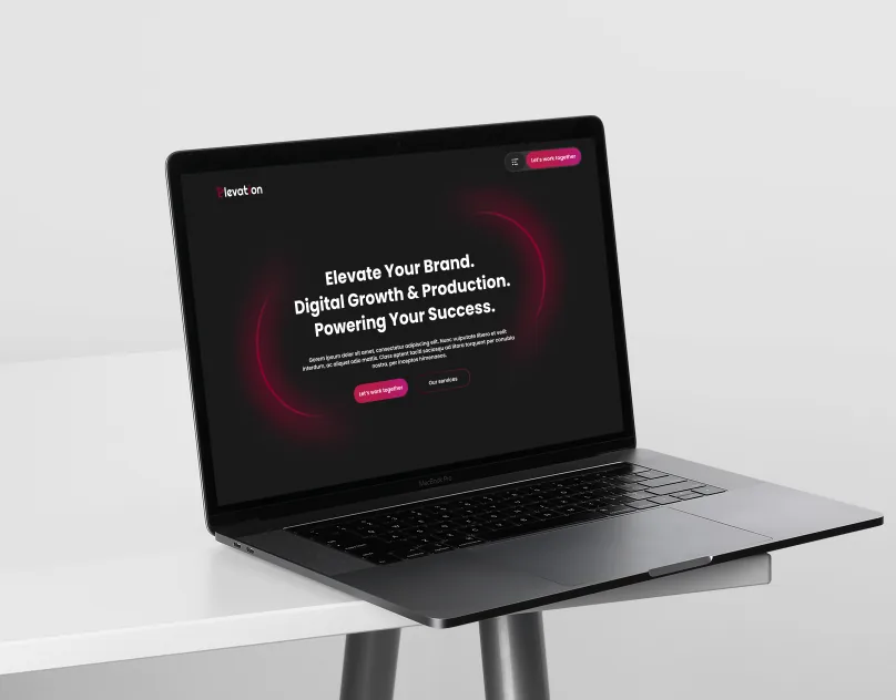
    A website for a digital marketing and production agency: elevate your brand, digital growth and production, powering your success.

  2. PodBooker

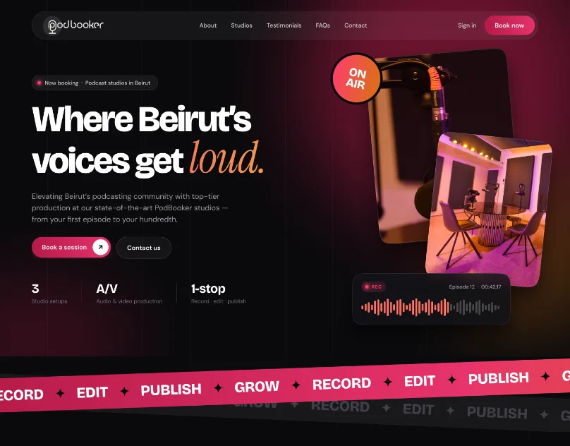
    A booking website for PodBooker, innovative podcast production studios in Beirut: pick a studio, choose a package and book a session.

  3. Jet Booking

    A mobile app for booking private jets: browse aircraft, check the details and book a flight in a few steps.